Pennsylvania Pollination Services
Background
Pollinators provide an annual estimated 30 billion dollars worth of ecosystem services in the US. However, the distribution of these pollination services is not uniform as only 20% of US counties account for 80% of these services1. Much of this variation can be attributed to concentrations of crops that are highly dependent on pollinators being located in a select few agricultural ‘hubs’ (E.g., California’s almond belt). Understanding the geographic variation of pollination services is critical to identifying the crops and areas most dependent on these services at local, regional, and national scales.
This map was created for one of my responsibilities as a research assistant with the Penn State Grozinger Lab.
Data
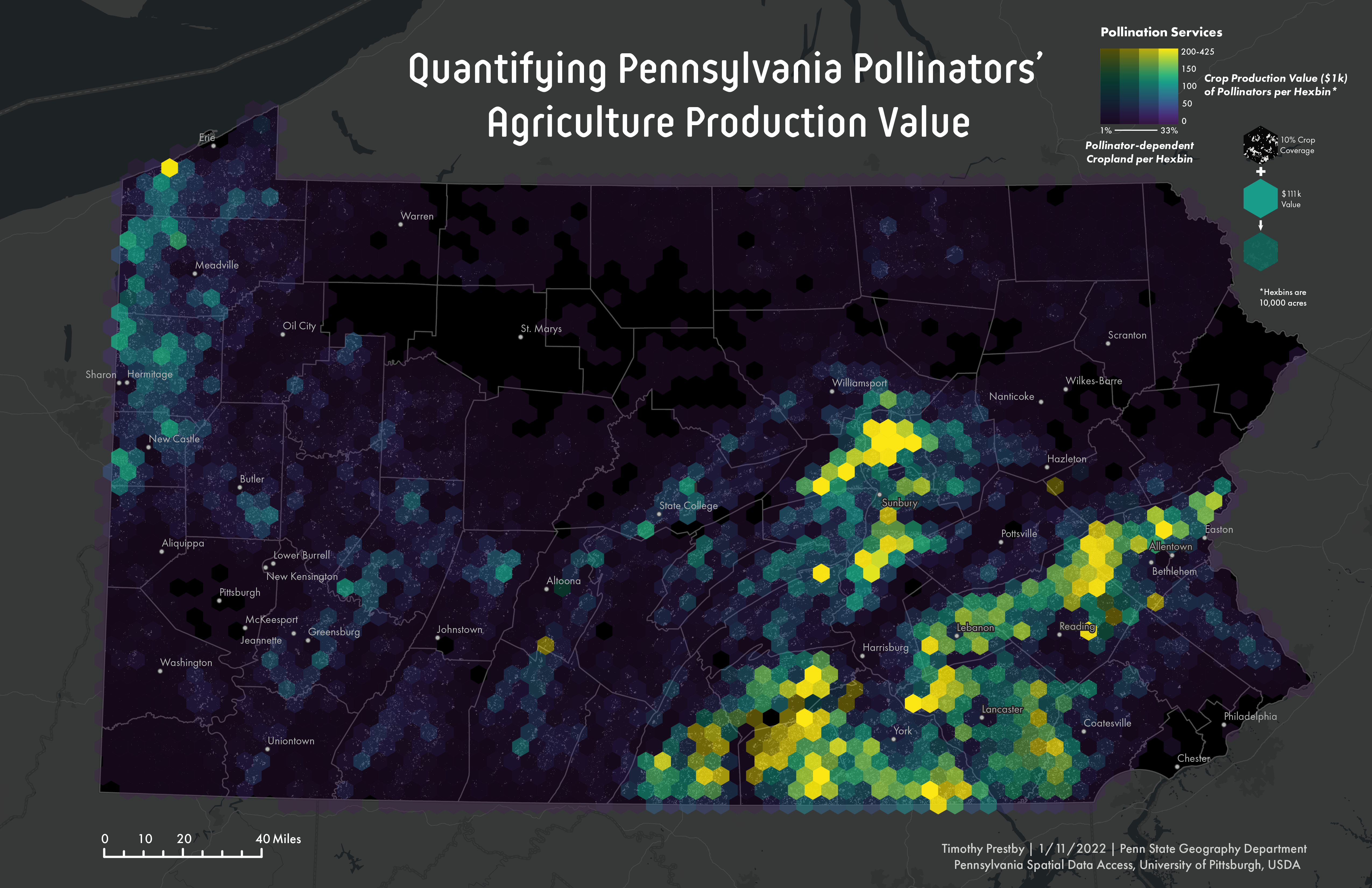
The map uses Our data from our research partners at the University of Pittsburgh who created a nationwide dataset of pollination services values. These values were calculated utilizing the USDA Cropland Data Layer and pollinator dependency of different crops. The resulting dataset estimates the economic value ($) that pollinators provide at an extremely fine-grain resolution of 30m by 30m pixels.
Most of the pixels across the US have a zero value because many major crops are not pollinator dependent (e.g., cereals), and/or areas are not cropland or forested. Consequently, it is difficult to visualize the raw data at any non-local scale because the pixels are tiny and spaced out from one another.
Representation Strategies
To address this issue, I experimented with different aggregation and bivariate mapping techniques. Namely, I used the aggregation strategy, tessellation, that creates an arbitrary number of polygons to fill up the data’s complete spatial extent. Hexagons are used as the polygon shape since they have cultural connotations of bees, a major pollinator. This map features two hexagons of 10,000 acres. The pollination service value of each hexbin is a sum of the constituent pixels’ values within a given hexbin.
To tackle the ecological fallacy problem, a bivariate mapping technique, value-by-alpha, is used. Value-by-alpha maps symbolize two different datasets using two different visual cues: color and transparency. This map uses color to encode a hexbin’s pollination service value and transparency to encode the percent of a hexbin containing pollinator dependent crops. Although it is generally recommended to use fewer than three different colors for value-by-alpha maps, the maps on this poster use a continuous color ramp known as Viridis. Viridis is a perceptually uniform color scheme that is designed to function especially well for people with color vision deficiency and make differences easy to see.
Reflection
While aggregating the pixel data to hexbins made the data more readable, this operation also suffers from the modifiable areal unit problem. Future work could conduct spatial regression to merge the most correlated spatial units into one unit or evaluate other unit sizes.
To help disclose what the individual-level data looks like, a value-by-alpha symbolization scheme is applied. Effectively, readers can see the distribution of individual-level data underlying each hexbin. Still, every pixel does not share the same value, so this is not the ultimate way to address the ecological fallacy problem.